Baan Dar
Citizen
 I was Hircine's Follower/ Bonelord at Ye Olde Forum
Posts: 32
|
Post by Baan Dar on Aug 20, 2005 10:54:25 GMT -5
|
|
|
|
Post by CagedinSanity on Aug 20, 2005 12:04:30 GMT -5
All of the relatvely ordinary, nothing really stands out that makes you go "w00! that's sweet!" but.. yeah.
5.9/10 for the lot.
(do note that is a decent rating, ratings don't get bad untill 4.9 and down)
|
|
Acer
Gladiator
 T3H L33test Elite Master! Acer > You! <3!
Posts: 135
|
Post by Acer on Aug 20, 2005 20:53:13 GMT -5
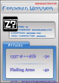 - Image is not bad. I like the bars on that, but the text on those words are a bit hard to read. So improve on that. My Overall Rating: 5/10!  The Winged Angel Image: The Winged Angel Image: It's not that bad, although the character on the left needs some improvement. Overall, nice job. My Overall Rating: 8.5/10 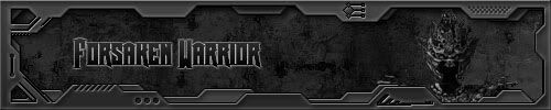 Forsaken Warrior Image: Forsaken Warrior Image: Not bad at all. I do like the bars you put up there. Good design. The character on the right does need a bit improvement, but good effort. My Overall Rating: 6/10!  Crazed Monkey Image: Crazed Monkey Image: I like this image. I believe it's like abstraction and all that. I like those wavy lines, though the images are a bit hard to see and the text at the bottom right is small. Good job anyway. My Overall Rating: 7.5/10! 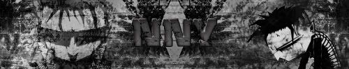 NNY Image: NNY Image: It's not that bad, although the colours doesn't look right to me. Those characters does need some work done. My Overall Rating: 4.5/10! 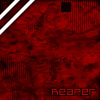 Reaper Avatar Image: Reaper Avatar Image: I like the design. The colours are like kinda blooded, but cool. I do like the squared animation moving. The two stripes... on the top left are nice. The text on the bottom right is a bit small, but still good. Good effort. My Overall Rating: 7.5/10! 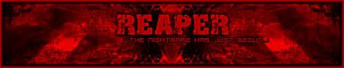 Reaper - The Nightmare Has Just Begun Image: Reaper - The Nightmare Has Just Begun Image: Wow! It looks pretty cool to me. I like the red blooded colours. It does fit nicely too. I like it, keep up the nice work! My Overall Rating: 8.5/10!  - This banner is pretty well-done. I like the image of this. The colours are nice and I like the words. Overall, that's a nice effort on it! My Overall Rating: 9/10!  Kirara Image: Kirara Image: It looks pretty nice. I like the font of it. Blue is a pretty good colour to use. And the animals are cute. Awww. I like it! My Overall Rating: 8/10! Well, those are the stuff there too. Phew... |
|
|
|
Post by Jon on Sept 9, 2005 21:24:45 GMT -5
eh, better than anything i could do. but as hemotep said, nothing really catches my eye except for maybe the reaper one, that one looks awesome.
7/10
|
|